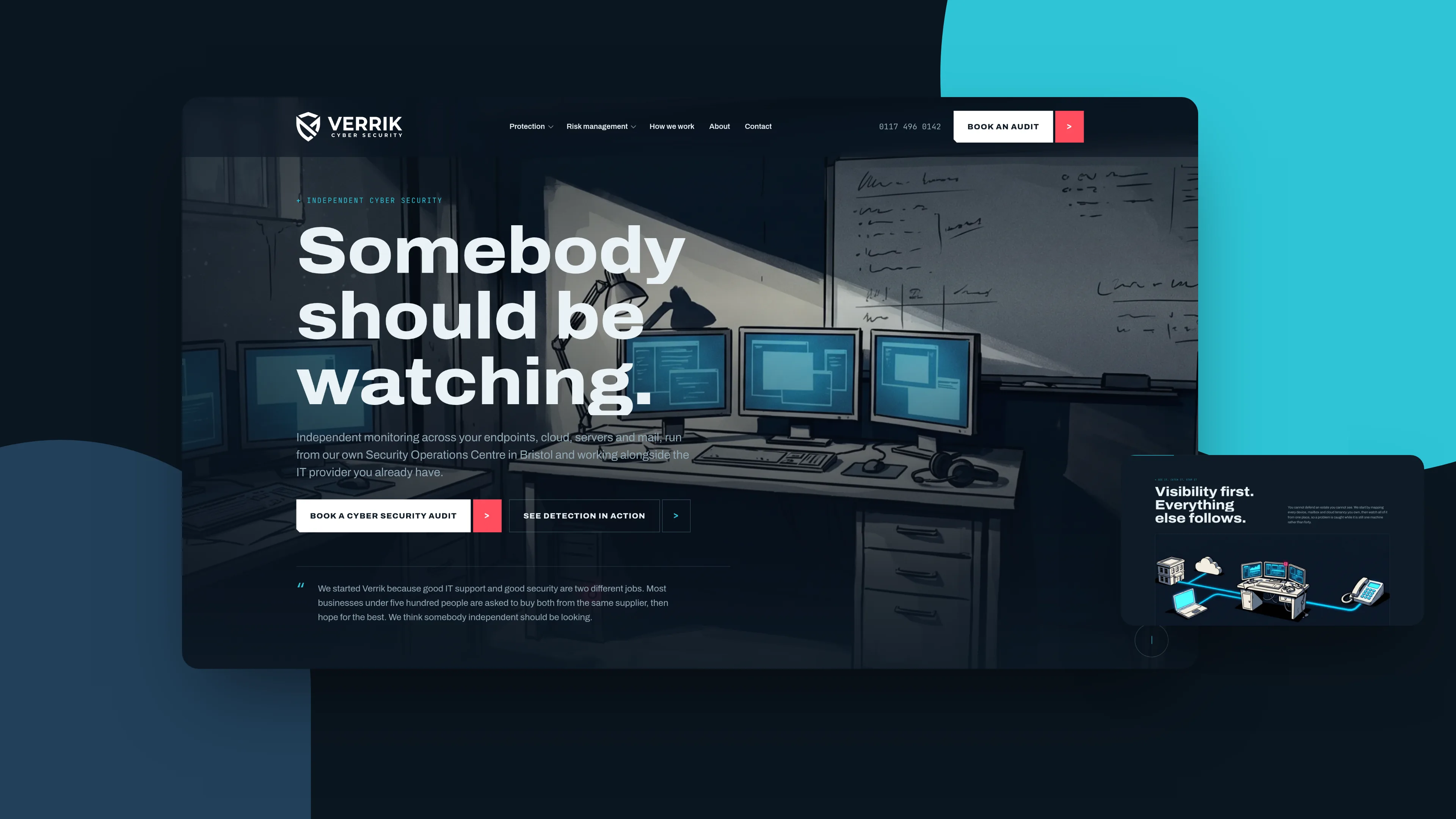
Verrik, a security brand that says the quiet part out loud.

Brand & website ยท 2026

Cyber security sells badly because everyone sells it the same way. Padlocks, shields, a wall of accreditation logos. We built Verrik to argue instead, and to look like it means it.

Verrik is an independent cyber security firm in Bristol, running detection and response for UK businesses that already have IT support and are quietly worried that is not the same thing.

The category has a copy problem. Every site in it opens on the same padlock and the same promise to keep you safe, so a buyer comparing three of them cannot tell them apart and defaults to price. None of them will say the uncomfortable thing, which is that the people who built your network should not be the ones grading it.

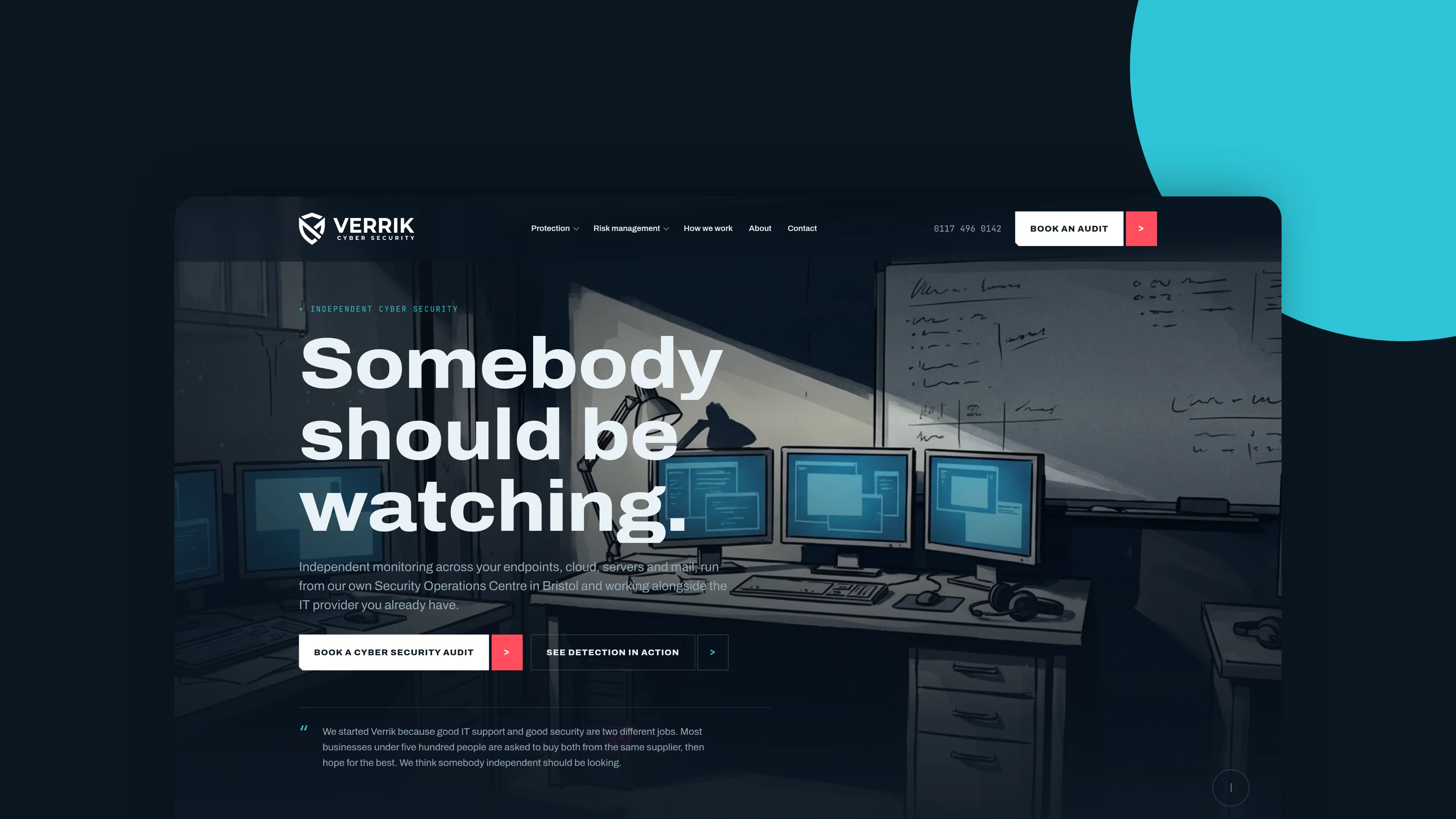
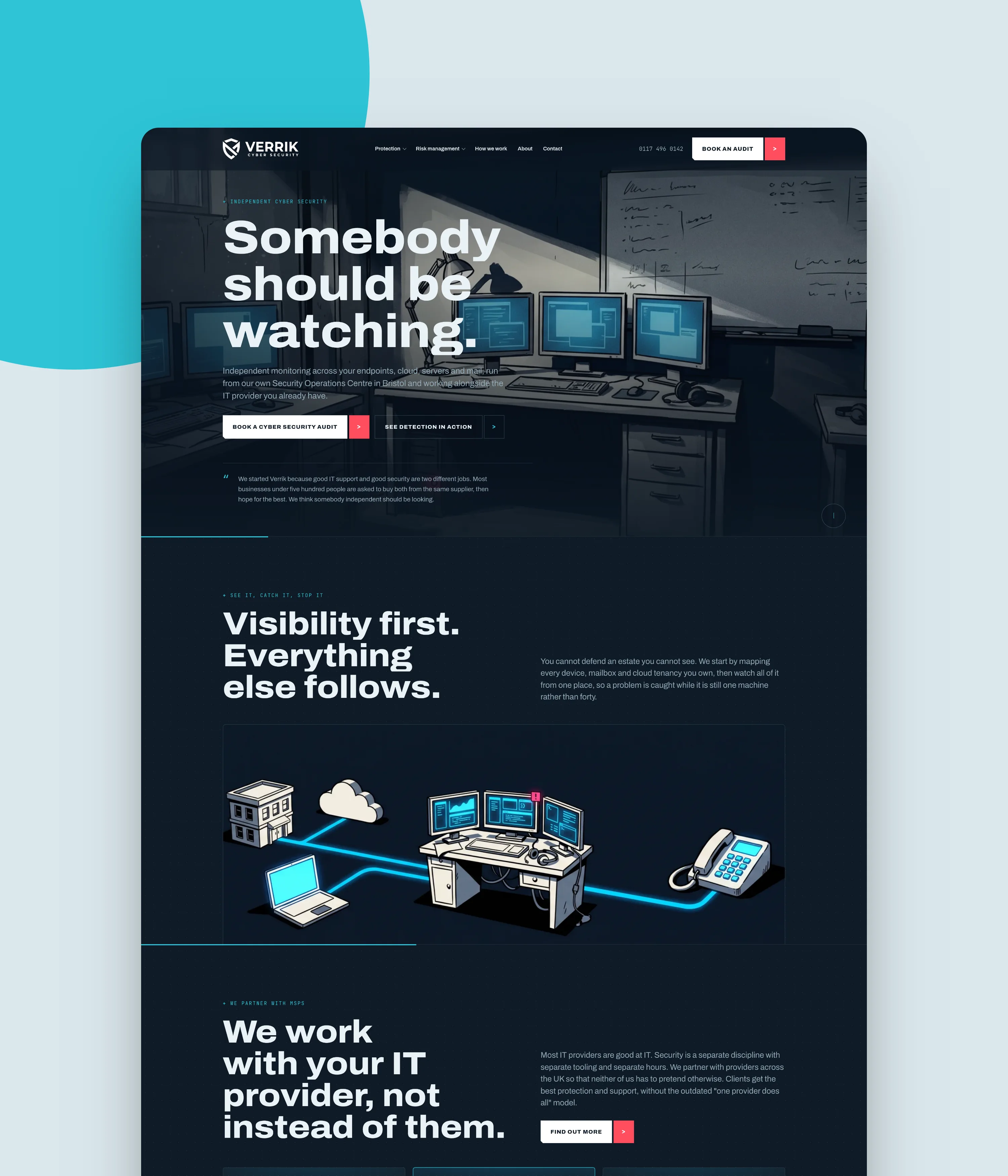
So the whole site is built on one line. Somebody should be watching. Everything after it argues that IT support and security are two different jobs, and that nobody should be marking their own homework.
Industry

Cyber security and managed detection

Location

Bristol, UK wide

Brand

Petrol and teal, with one signal red kept back for the moments that matter. Most security brands reach for near black and neon, which reads as a games console rather than a firm you would hand your network to. Lifting the ground off black gives the illustrations somewhere to sit and makes the red mean something when it appears.

The mark is a shield, because in this category you do not get to be clever about the category. What you can do is draw it properly, once, and then never repeat it anywhere else on the page.

Website design

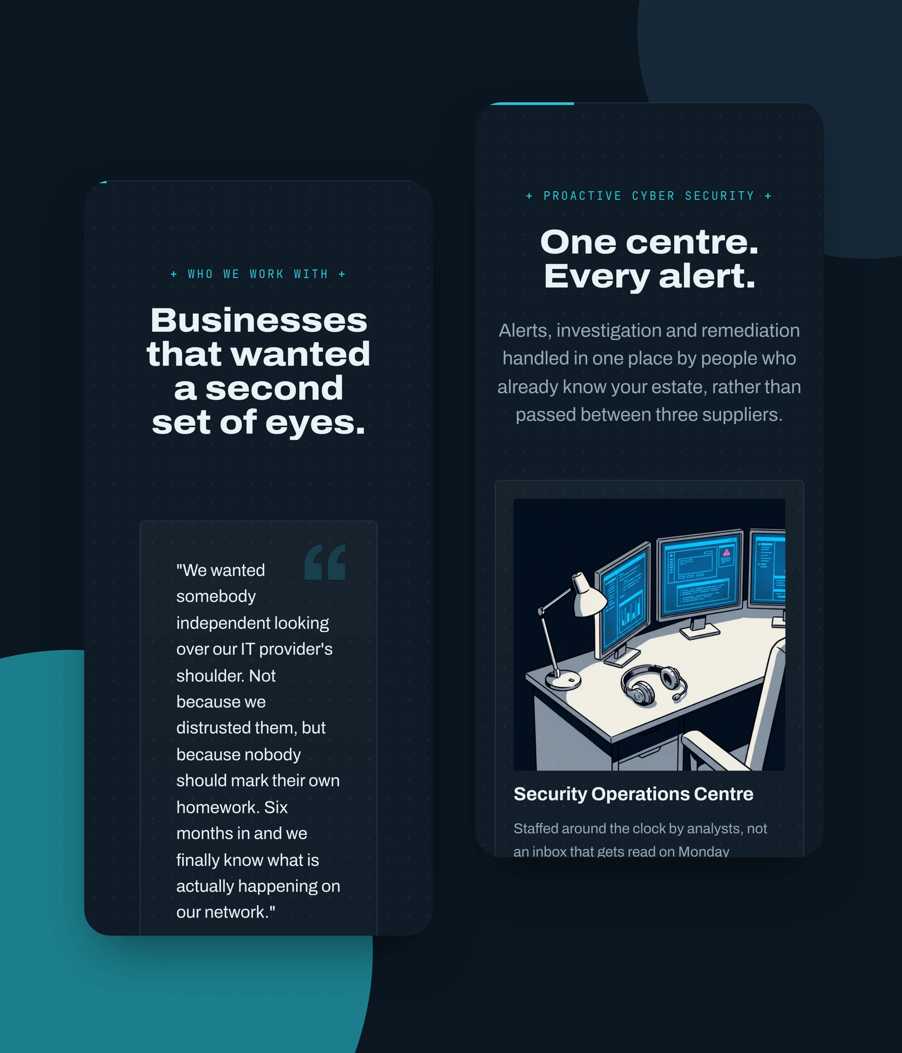
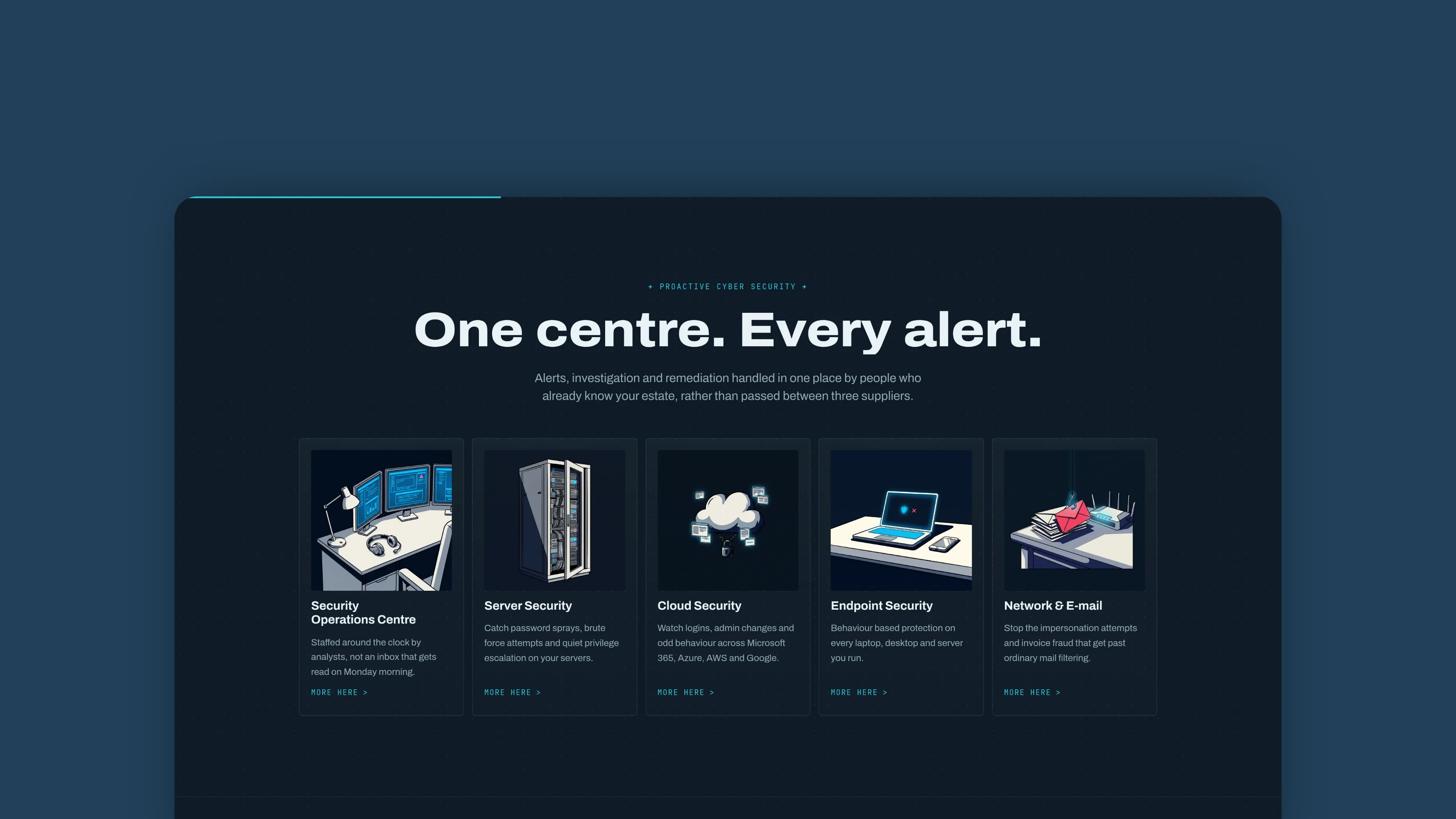
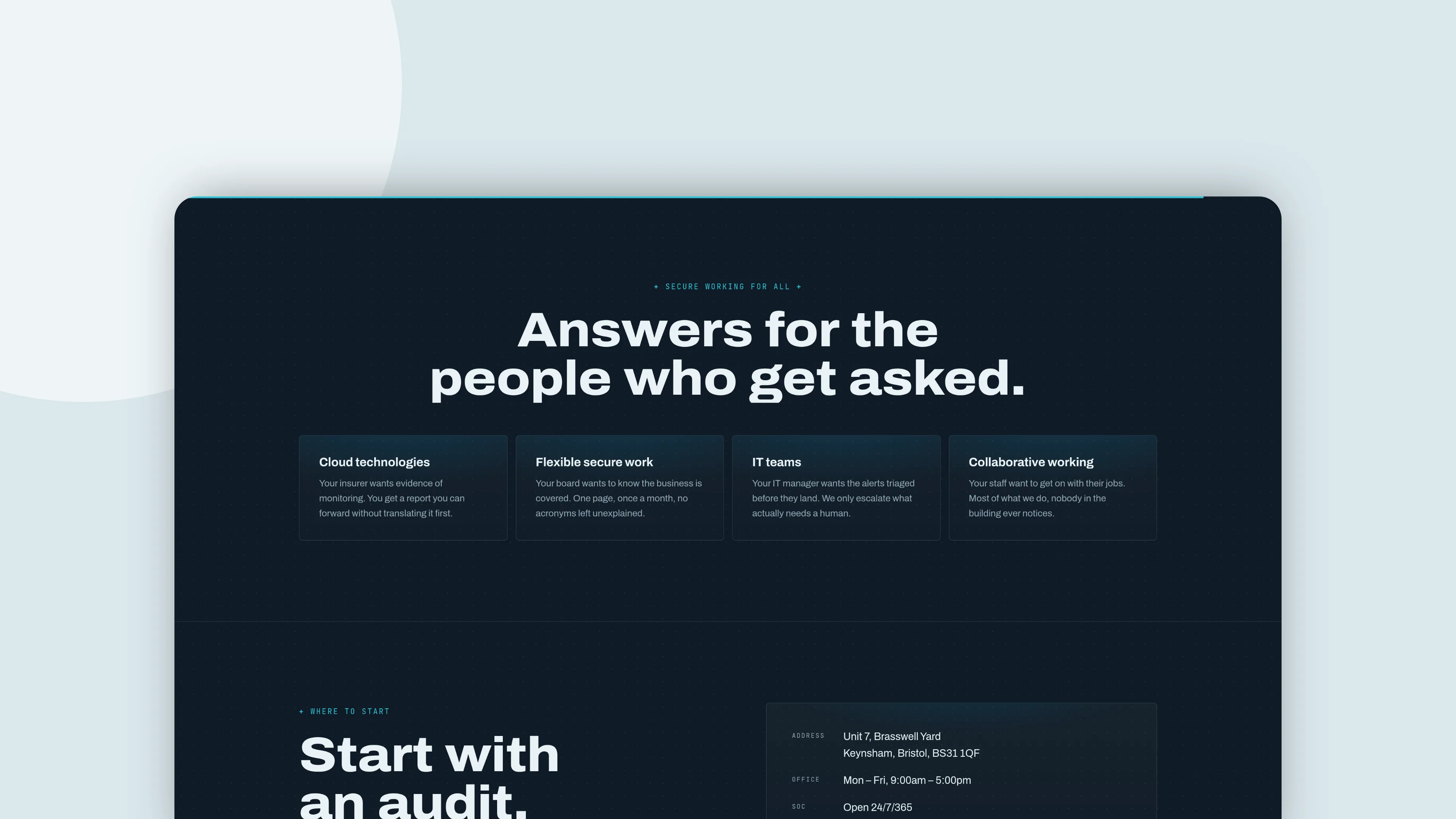
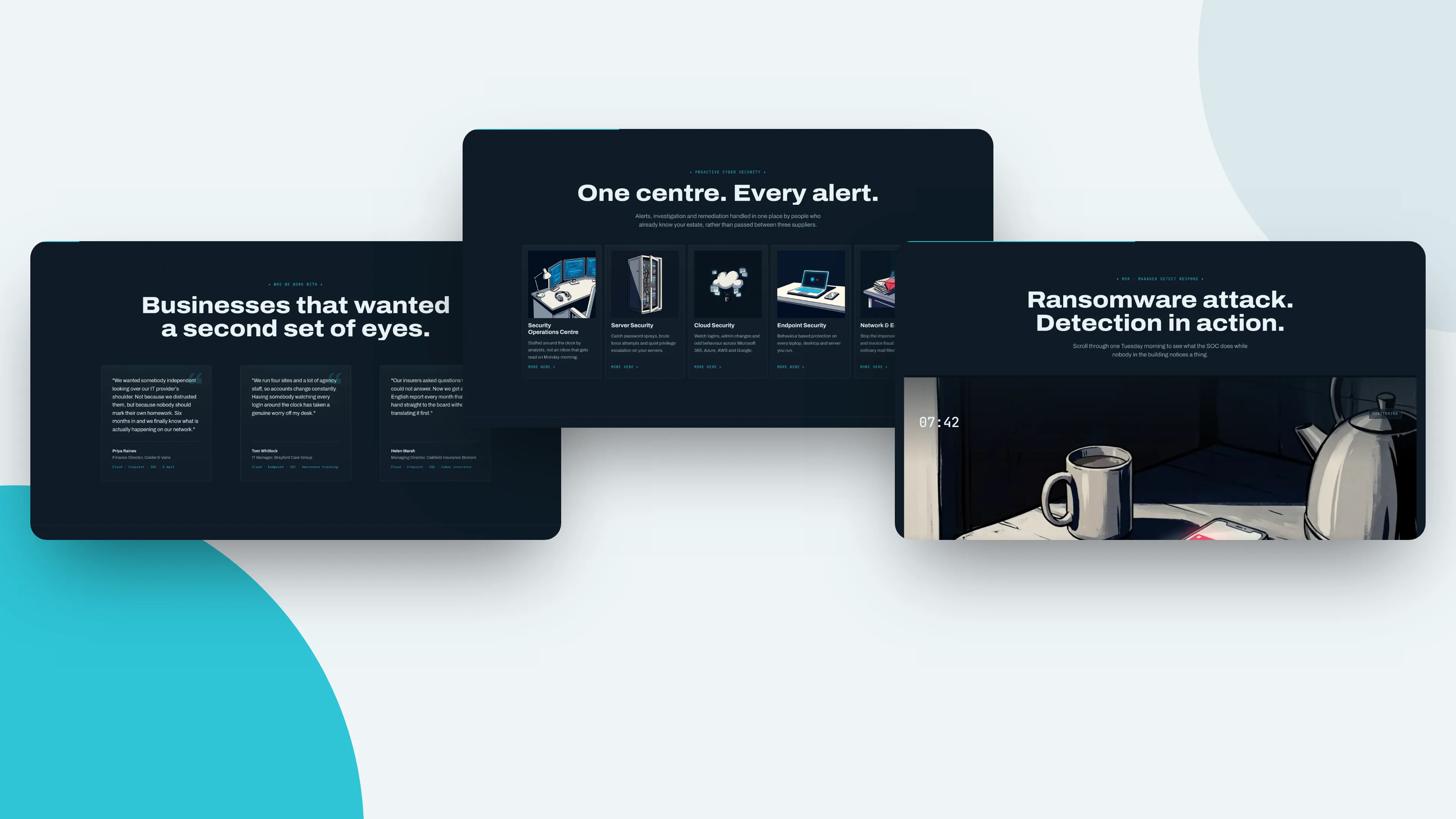
One page, argued in order. The threat, the gap between IT and security, what actually happens at three in the morning, then the audit that starts the conversation. No service grid, because a service grid lets the reader skim past the argument.

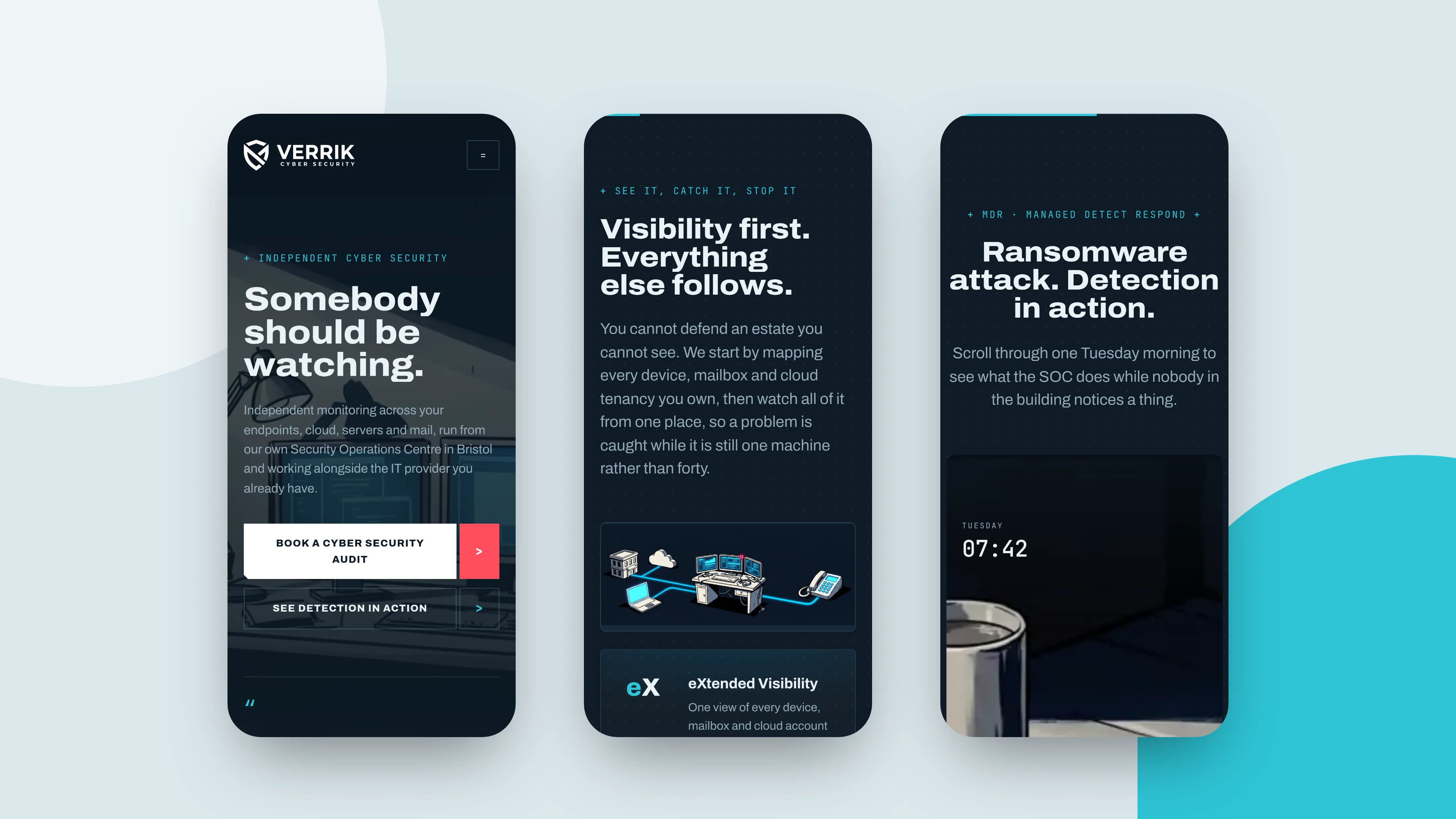
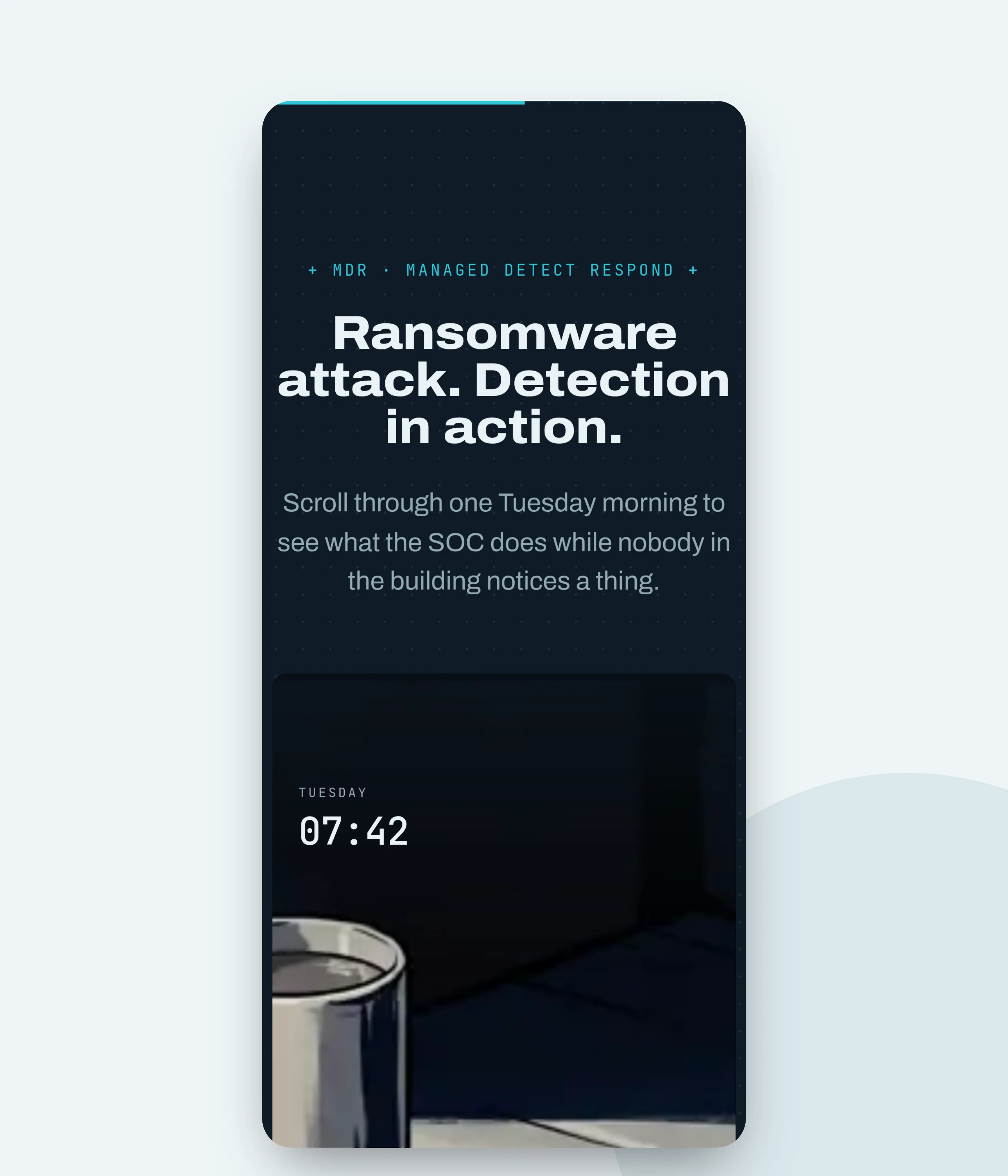
The centrepiece is a scroll-scrubbed film that runs the length of a section. A ransomware note appears on a screen in an empty office, the kettle is still warm, nobody is there. It plays at the speed you scroll it, so the reader sets the pace and cannot look away from it either.

Everything the category usually does is deliberately absent. No accreditation pills, no numbered process cards, no scrolling logo strip.

Website development

Hand built. GSAP and ScrollTrigger, no framework, no build step. The film is a 222 frame image sequence drawn to a canvas and driven by scroll position, with a separate lighter set served to phones so the page is not pulling desktop frames over 4G.

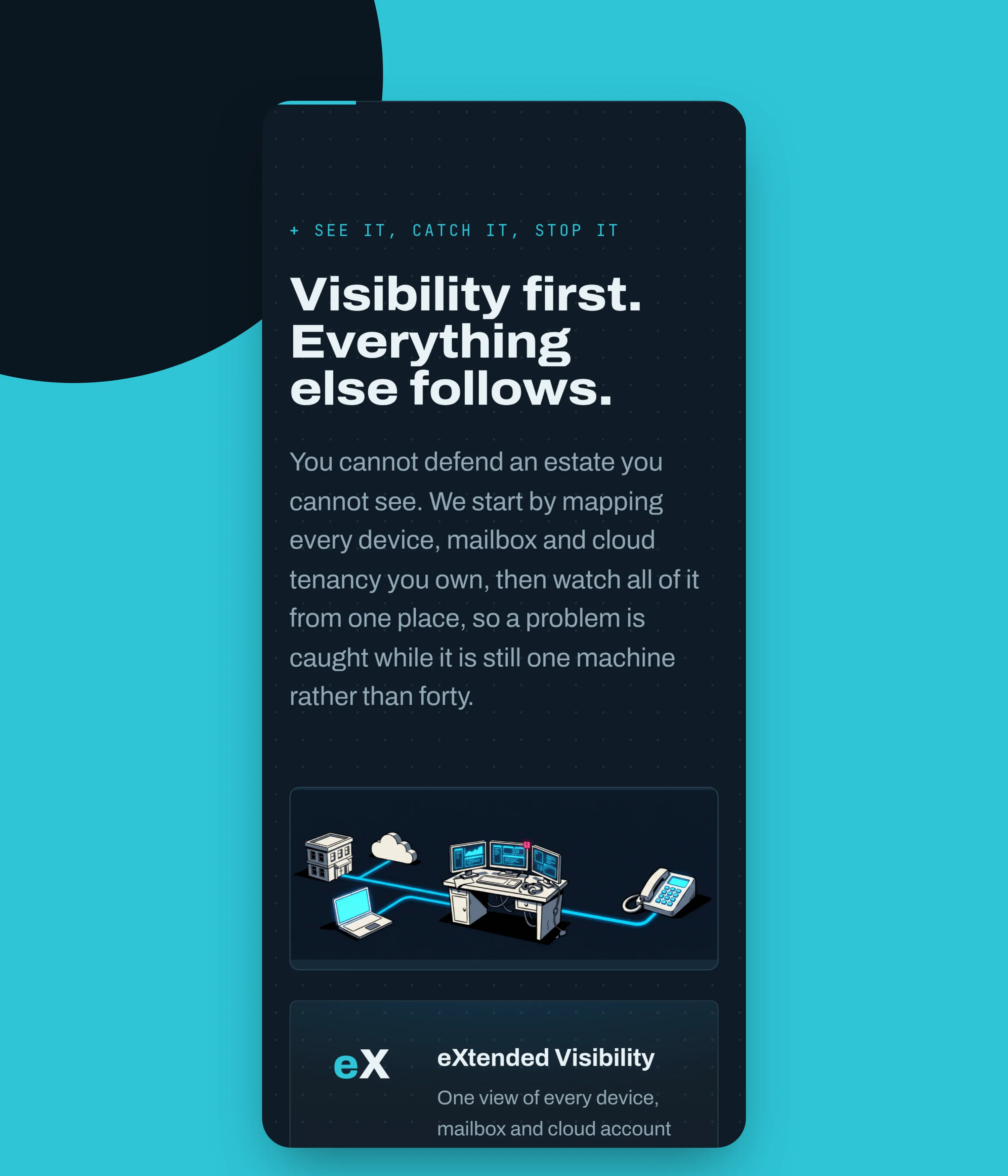
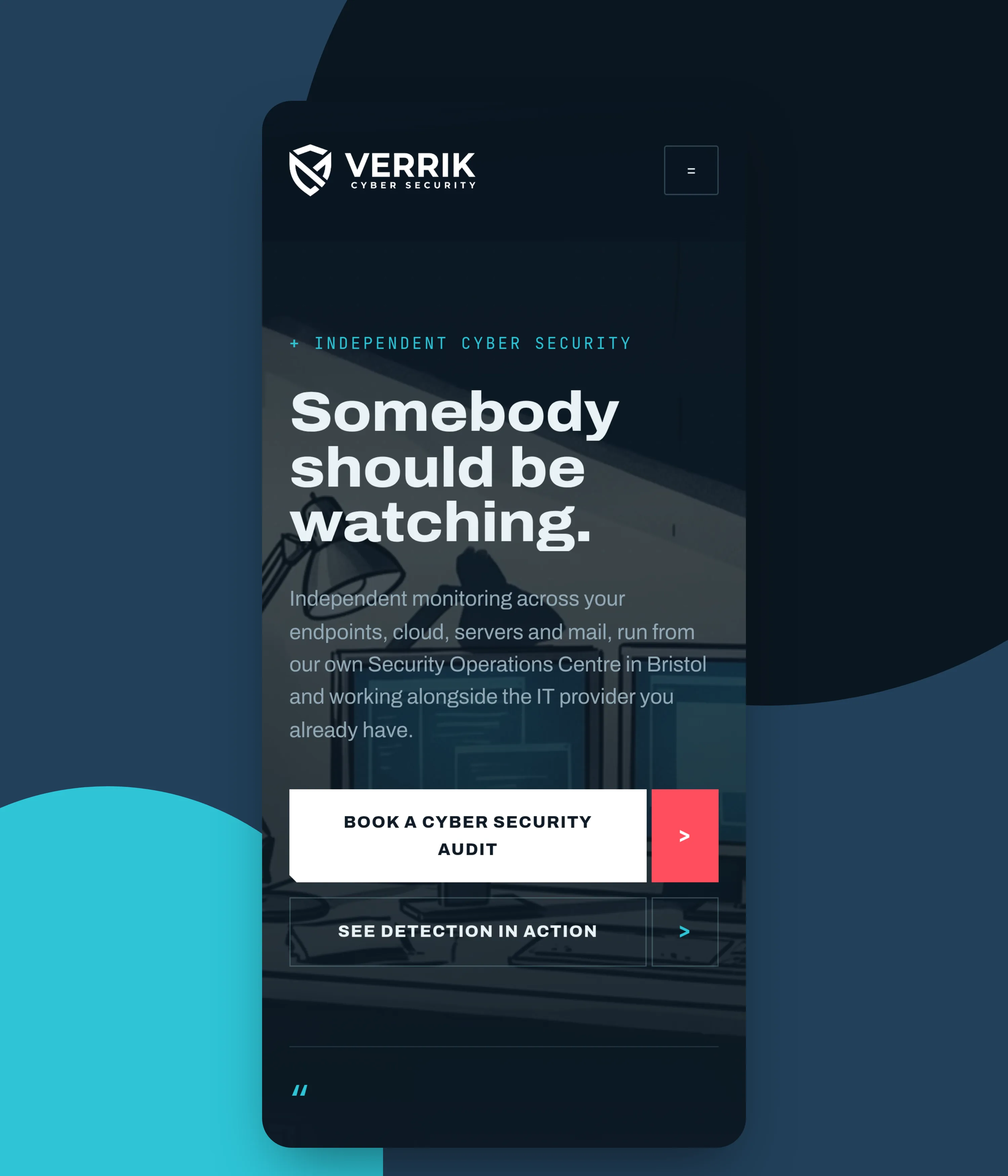
The hero artwork drops back on small screens and the scrim gets heavier, so the opening line stays readable at the size most people will actually meet it.